Tuesday 9 July 2013

The Baxter's Home Renovation (Space Planning Finals Project)

The Baxter family is soon to move in a one-storey bungalow after they make some significant restorations on the property that best suit their preference and lifestyle. Their idea of a home is modern and contemporary but does not lose the warmth of a typical home.  They want the 1940 structure to be transformed as their urban sanctuary.  The theme of the house was inspired by the element of water.  The design emphasizes the fluidity of each area of the house and its serene atmosphere.  The color palette matches perfectly with the personality of each member of the family as well as the accent pieces/areas of the house.


The couple’s career fields are quite different and so they want their home to cater to their respective fields, especially Mr. Baxter, who works a few hours from home.  In this light, a small work space is essential for their new home.  An exclusive work area which is conducive for a home office must be carefully planned out.  With his fondness for solid wood flooring, a warm hardwood floor would fit perfectly for his home office to give off a temperate yet masculine vibe.  Also, hardwood floor provides a healthy living environment.


Mrs. Baxter’s inclination for the arts is another relevant consideration.  Her very own artworks that fill their home is her personal touch.  Mrs. Baxter’s collection, that ranges from ancient to contemporary genres, adds character to their home.  Her art collection fuses fluidly with the spacious area of their living room, enveloped by the large windows and doors, which warmly welcomes the natural warm light from the exterior.   This highlights and illuminates almost immaculately the wide array of masterpieces by her favorite artists in their den.  The asymmetrical arrangement of the artworks set the tone for the walls.  To update the look of the once-conventional house constructed decades ago, Mrs. Baxter decided to place several display shelves that showcase her top-of-the-line collectibles.  The shelves boast of the most dynamic collaborations of canvass paintings, sculptures, and photos.  To add to this modest semi-museum and to make the area more cozy and inviting, tailored petite chairs that match the display shelves provide the convenient seating for an assortment of contemporary and ergonomically designed vases and bowls. 

    The kitchen and dining room, which reflect the couple’s passion for cooking and dining, is considered the core of their home.  Their delight in inviting over guests and having them over for what can be a simple meal to an extravagant dining experience, inspired the design of this particular space.  A large island is strategically positioned and functions as the focal point of the expanse.  It somehow serves as the traffic cop that divides the kitchen from the rest of the room.  It also serves as a common area where invited family and friends can sit and enjoy each other’s company.  To pull everything into a cohesive whole, old appliances were eliminated.  Replacing them are the backsplash tiles and stainless steel appliances with sleek graphic flooring.  An artichoke-like light fixture that brings a warm glow accentuates the structural beauty of this space.

With a daughter who is now a teenager, Mr. and Mrs. Baxter made it a point that their daughter had her own personal space that is a mirror of her personality.  They specifically wanted a space where their daughter can move freely without restrictions and feel comfortable in doing so.  Also, a methodical storage system is vital in maintaining a clutter-free environment for the daughter’s independent space.


Finally, to pull things together in cohesion and harmony, they decided to go with white paint to brighten the ceiling.  It also provides a clear canvas for the redesigning of the home.  They painted the accent wall a unique and serene shade of aqua blue, giving a calm and pleasant ambiance.  As accent color, the house had metallic silver and cream silver for all other spaces.

The Baxter’s house is not simply a structure.  The design was specifically personalized and tailor-made for the family’s needs, interests, inclinations, and dynamics.  It reflects the characteristic of each of the family members as well as their nature as a whole.  It is a haven for the Baxters, facilitating the warm interaction between the family, as well as their visitors.  The productivity of each of the house’s areas and the aesthetic visual flow is truly one of a kind, an accurate and precise blueprint of the family’s lifestyle and personality.


Friday 16 November 2012

NEW YORK, NEW YORK


New York is known to be a melting pot of different cultures.  This means different ideals of different people from different walks of life.  As a famous song would say, this city will inspire you.  I was very lucky to have witnessed myself how rich and diverse the culture is in New York.  And of course, considering how keen my eye is for details and beautiful structures in general, what caught my eye are the different architectural sightings.  Needless to say, visiting this city will ignite an artist’s creative instincts because it presents so much vision.

Indeed, you cannot miss the famous NY landmarks and tourist attractions.  I made it a point to go to the various establishments and places which the city is known for.  Among others, I was able to visit the Statue of Liberty, Rockefeller Centre, the Chrysler Building, the Grand Central Terminal, the Metropolitan Museum of Art, and the famous Times Square.


Statue of Liberty


Empire State Building


Chrysler Building


Rockefeller Center


Time Square


Radio City


View from Top of the Rock


Ground Zero


I will not attempt to describe and elaborate on each of them since I am not an authority on these matters.  Rather, I will try to share my general take on the majesty that is New York from my own point of view as an artist.

The diversity of the citizens in the big apple is probably the reason why its architectural assortment is so rich.  All of the structures are significant representations of the seven continents of the world.  Not only that.  New York boasts of designs that are bold in pattern, colour, texture, abstractions, and inspiration.  It presents so many stimulating experiences for the eyes that tourists like myself will feel the genuine love of the New York citizens for their city.


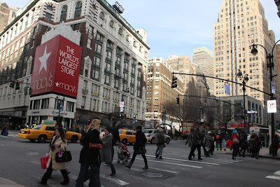
5th Avenue


Madison Square Garden


Grand Central


I fell in love with how the people from New York were able to freely characterize all the possible types of people you could think of.  A part of the city structure will make you feel sophistication and class.  Another area of the city structure gives off a general sense of calmness which is far from the hustle and bustle of the busy life of urban living.  Other establishments and designs will cater to the artsy type of people, displaying eccentricities of many forms.  Yet other fragments of New York houses cultural preservation, conserving centuries of history and civilization.  And some other portions of the city contains structural enterprises which leans towards the metropolitan living, the fast-paced lives which most New Yorkers are used to.


Charging Bull (Wall Street Bull) Symbol of aggressive financial optimism and prosperity.


St. Patrick's Cathedral


Brooklyn Bridge


The detailed and varied architectural designs of the structures in New York City make it very difficult to label the general feel of the city, design-wise.  Defining its design philosophy would be an insult because not one word lifted from the dictionary will accurately state how beautiful New York is or what exactly sets is apart from all the cities in the world.  One thing, though, is for sure: New York, in itself, is a huge work of art, a virtual museum which you should never miss in your lifetime.

Thursday 15 November 2012

EGYPTIAN ACCESSORIES: We Met at the Met


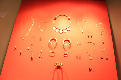
During my visit to New York, I made sure that I visit the world-famous Metropolitan Museum of Art.  It is every artist’s dream to see with his or her own eyes the wonderful works of art exhibited in the museum.  I was well aware that the museum featured different artifacts of the Egyptian civilization.  The beautiful and well-preserved pieces were so striking and I wish to share what struck me most, which were the Egyptian accessories.


According to http://www.allaboutgemstones.com, olden Egyptian jewelry-making was not merely an artistic expression.  It also spoke of the religious  and social aspect of their civilization. It symbolized their beliefs, power, and influence then of the Egyptians, particularly the Pharaohs and the affluent citizens of the society.  This explains the extravagant designs, symbolic figures, and use of materials.


The jewelries presented at the museum are very demonstrative of the Egyptian accessories that we know of: eccentric, bold, and rare.  They are so distinct because they have a certain character on their own.  They are statement pieces which stand out from a crowd.  These attention-grabbing jewelries are so luxurious in nature that any jewellery-loving woman will be amazed at its detail and elegance.


I have seen a few commonalities among the Egyptian accessories.  First is their use of gold-plated sheets of metal. Compared to the typical accessories that we know of today, the early Egyptians were more liberal in using the metal sheets.  The bold pieces demand attention because of its flashy
designs.


Next, I also noticed that they are fond of using accent colors to enhance the aesthetic value of their jewelry.  Mostly, the exhibited pieces used shades of blue but more on the lighter hues, orange, and a little bit of very light green.  Met Museum also featured jewelries that took forms of different figures such as birds and flowers.


Today, we see many jewelries in the market that are very much inspired by the Egyptian civilization.  World famous jewelers have taken on a greater appreciation for the Egyptian culture by incorporating them into their design which celebrities flaunt when they walk the red carpet.  Here are a few photos which show how Egyptian jewelry design has influenced the contemporary jewelry industry.


Truly, the Egyptian influence in jewelry or accessories making has transcended through the centuries.  Some alterations or modifications have been made to modernize the Egyptian look but what stays is the sophistication, eloquence, and splendor that rightfully represents its civilization. 

(Credits)
Photo sources of celebrities wearing Egyptian influenced accessories:


http://www.fashionbombdaily.com
http://www.examiner.com
http://www.cinesfashion.blogspot.com

Party Organizing

I have always been fascinated with detail, elaborate planning, and personal touches.  That is why having the opportunity to plan for the different parties has become one of my favourite creative outlets.  It is a chance for me to unearth my creative alter ego and give celebrants the best memories of their childhood.


Party planning is not all glitz and glamour.  Not everything is as colourful and bubbly as the kid celebrant.  Because I want them to approve of everything beforehand, I make sure that whatever step I make should be according to her liking.  In short, it is a collaborative effort of my scrupulous planning skills and children's youthful idealism.


Choosing a theme is the first step of party organizing.  This is not as easy as it looks because what I think and what the client likes may be completely different.  To make sure I execute the theme properly, I ask what they want.  This way, I know exactly how to go about the other details.


Next comes the guest list.  Creating this guest list is not so difficult for me because all I need are the special people for the client.  After this, I go into the details.  This includes the venue for the party, the invitations, caterer, party favours, souvenirs, program, and the like.  The central theme of the party should be evident in the details.  Moreover, the individual details should be seen as a whole and not as segmented parts of the party.  I am proud to say that despite my busy schedule, I make it a point to make the souvenirs, invitations, and other favours.  I find that when I have my personal touch on these things.


Putting together a party that is well coordinated is a combo made in heaven: a marriage of art and my life’s bundle of joy.


It takes a lot of creativity, patience, resourcefulness, perseverance, focus, and ingenuity if you want to get into party organizing.  For me, what makes all of this party planning more meaningful is not the occasional tap from a friend, congratulating me for a job well done.  It is not all about seeing the others enjoy the party or become the talk of the town for setting up an extraordinary festivity.  Rather, seeing celebrators happy and enjoying their parties make all the efforts worthwhile.  Having an event done successfully is  my ultimate barometer when it comes to contentment.  I know I can finally say I am a certified party organizer in my own right when I see the precious smile from celebrants and guests.  That, in my opinion, says it all.

Furniture Designing


Designing furniture is another creative outlet that I enjoy.  As an Interior Designer, we can expect clients who will specifically want something that may not be readily or easily available in the market.  When these circumstances arise, what better way to satisfy your client than designing the furniture itself?  That is why I, myself, have come up with designs not only for clients but also for myself.  These designs are products of a thorough and comprehensive creative process.

How does one exactly design a piece of furniture?  It is not as easy as drawing or making a pattern or copying something off from a magazine, especially when clients are very meticulous and have high standards. 

 Below are photos of the pieces I have previously designed following the guidelines I have mentioned. They were part of a school project.


 Miniature Model of my designed wicker loveseat.


 Shop Drawing: Elevation and Isometric 


There are many things to consider.  One of them is functionality.  Although most would think that design would be the first important thing that clients, in general, are after, I found that most of them find that functionality and practicality tops their list.  When I design pieces of furniture, I make sure that they serve their purpose well.  For example, a simple chair is easy to design.  There are various ways you can imagine how a chair looks like.  But how does the client plan on using it?  Is it for the office where you have to sit for hours on end?  Is it for the living room where people usually stay for only an hour for a TV series?  Is it for the garden where people lounge for a few hours during weekends to unwind and calm their nerves down?  There are innumerable purposes for one piece of furniture and that must be clearly known to the designer well ahead of time.  It is also worth noting that some clients prefer pieces that are multi-functional.  They want to save money and therefore, a table would become a better option if you can place it on the den and, if need be, can be moved to the bedroom without much hassle.

Another major consideration is the quality.  This goes hand in hand with functionality.  A client would want a piece that will stand the test of time and not be easily replaced because it was, say, unable to carry a certain weight.  Furniture designers must take note that the materials to be used should be sturdy and durable.


 Decorative Bolster pillow for Furniture Design project.


Next on the list is the design.  Of course, having an eye for the correct pattern, colour, texture, material, etc., should be a skill every designer should master.  It is best for a designer to have a level of taste that can cater to different clients, whether they be eclectic, edgy, classic, modern, chic, and so on.  The variety that are out in the market are so diversified that it is very easy to almost duplicate designs; maybe not exactly the same but something very close to an available piece of furniture.  Although this is an unavoidable situation, a designer can shun this possibility by adding her own touch to the design.  As they say, no two brains are alike.  So when a client and a designer come together to really think through the design based on the client’s needs or preference and the designer’s creative input, you are sure to produce a design so unique and personal, something that the market has yet to offer.  (Note:  A designer would be doing the client a huge favour if the furniture’s design can easily blend with other parts of the house other than the original part the piece was initially designed for.)

Last but not the least is cost.  Other designers would make this a last consideration but I say it depends on the clients.  Some do not mind splurging on a single piece of furniture while others are working on a tight budget.  A good designer can work well within whatever budget is given without sacrificing functionality, quality, and visual aesthetics.


I believe that the fine skills of furniture designing take time to enhance and develop.  I am still in the journey towards being a designer of good, maybe even brilliant, furniture.  Soon enough, who knows? I might be designing yours!

Friday 12 October 2012

Flipping Through My Sketch Pad


The following sketches were mostly products of the freehand drawing classes I took during my undergraduate studies.  The course was aimed at enhancing skills which were very essential to Interior Designing.  Throughout the entire freehand drawing course, we were strictly prohibited from using any kind of straight edges such as stencils, templates, and rulers.

 
Generally, freehand drawing is a style wherein an artist interprets a subject as it appears under a given light source.  This specific look is primarily achieved by applying simple shadowing techniques.  


If one lacks the fundamental skills of freehand drawing, one can follow basic pointers to develop dexterity.  Probably the most important and crucial key is drawing inspiration.  This simple step may be achieved by looking at pictures, photos, scenery, or by simply taking in one’s surroundings.  It is necessary that one does not confine himself within the standard limits.  It is always best to go beyond the normal perspective and find beauty in the most mundane of things.  Find your vision and let the creative juice flow.  Also, to facilitate in the development of the basic freehand drawing skills, it is advisable to practice.  Simple exercises like doodling and scribbling, which is often overlooked and underrated, can immensely help in refining an artist’s dexterity.  From doodling and scribbling, we expect to grow more proficient in handling your pencil precisely the way it needs to be handled.  Soon enough, the artistic process will take its natural course of progression.


On the technical aspect of freehand drawing, an artist must take note of the importance of using the right kind of pencil.  We determine the exact type of pencil to use depending on the objective.  Pencils are specifically classified to aid the artist in making the drawing more aesthetically pleasing.  Some of the most basic pencils that artists use for freehand drawing are 4H, which is known to be the hardest, HB in the middle next to F, and 4B as the softest.  Those who have experienced using the different kinds of pencils will attest to the fact that using the right kind of pencil can make a huge difference.


This is a product I am definitely proud of.  An estimated 4 hours of hard work was put into this work of art.  One can be as technical and careful in freehand drawing, but as I have learned from years and years of experience, a combination of time, patience, and artistic freedom are an artist’s best bet in producing the best freehand drawings a sketchpad will ever house.